

A brand color may look right on a website and very different across a large event room. Fabric absorbs light, flowers vary by season, and a bright screen can change how nearby shades appear. When we plan Corporate DC Event Design, we need to think about how those colors will work together in a real space. Our aim is not to copy a logo across every surface. We want guests to recognize our business while feeling comfortable in a room built for the occasion. Careful color choices can also influence how people experience different parts of the venue, from the entrance to the main presentation area. By planning these details early, we can maintain a consistent brand identity without compromising the event’s atmosphere or practical needs.
Begin With the Feeling We Want to Create
Before we choose flowers or table linens, we should decide how the event should feel. A leadership dinner may call for a calm, formal room. A product launch may need more energy and contrast. Our colors can support either goal, but the same palette will not suit every setting. We can start with our brand guide and the event’s purpose. Then we choose which colors deserve attention and which should remain subtle. This gives the design team a clear direction without limiting every creative choice.
Build a Palette That Works in Real Life
A screen shows color through light. A printed sign or fabric panel reflects light instead. That is why exact digital shades may look different once we bring them into the venue. We should request physical samples before placing large orders. For corporate event decoration dc, we can use one main brand shade, one supporting shade, and a neutral base. This keeps the space connected while leaving enough visual rest for guests.
A Simple Palette Checklist
- Main shade: Use it in a few clear focal areas.
- Accent shade: Add contrast through small details.
- Neutral base: Give bold colors room to stand out.
- Real samples: Compare paper, fabric, and flowers together.
- Venue test: Check how each material looks under the actual lights.
Work With Flowers, Not Against Their Natural Shades
Flowers rarely match a brand color with the precision of printed ink. That difference can be useful. A white and blue palette, for example, may work best with white blooms, green foliage, and blue accents rather than flowers dyed to an exact shade. We should consider the size of each arrangement, too. Low centerpieces help guests talk across dinner tables. A larger display can mark an entrance or welcome area. We can repeat related colors without making every arrangement identical. The result feels coordinated and still looks natural.
Use Texture to Give Color More Depth
Color is only part of what guests notice. Matte fabric looks soft, polished metal reflects light, and clear glass makes an arrangement feel lighter. Two objects in the same shade may look quite different because of their surfaces. We can use those differences with care. A formal dinner might pair smooth linens with subtle metallic details. A networking reception may suit textured upholstery and simple tables. Materials should also be durable enough for the event. A beautiful finish loses its value if it cannot handle normal guest use.
Connect the Palette to a Distinct Design Idea
Through personalized event design, we can connect colors to the message of the day. A company anniversary may draw on its history. A new product event might use a cleaner, more modern look. The palette becomes a starting point, not the entire design. A mood board helps us make these choices visible. We can place sample images of furniture, flowers, linens, and signs side by side. If one item feels out of place, we can change it early. This is far easier than adjusting a room after installation has begun.

Test the Lighting Before Approving the Colors
Lighting can change a color more than we expect. Under warm light, white fabric may appear cream. A dark blue backdrop may look almost black when the room is dim. We should never assume that colors viewed in daylight will look the same during an evening reception. When reviewing Event lighting design services in DC, we should ask for tests that reflect the actual event schedule. Presentation lighting must keep speakers visible, while dining light should allow guests to read menus and see one another.
Four Moments Worth Testing
- Guest arrival and check-in.
- Speeches or screen presentations.
- Dinner and networking.
- Photos near key displays.
We should look at the room from different seats, not just from the stage.
Respect the Venue’s Existing Colors
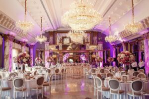
Many event spaces already have strong features: patterned carpets, wood panels, painted walls, or decorative ceilings. These are part of the room, whether we planned for them or not. We should visit the space before finalizing the palette. Rather than cover every surface, we can choose a few backdrops, table finishes, and floral pieces that work with what is there. This often produces a cleaner result and avoids spending money on decorations that add little value.
Keep Signs Clear and Guests Comfortable
A well-matched palette is not useful if guests cannot read the signs. We need enough contrast between text and its background. Entry signs, room names, and schedules should be easy to find without drawing attention away from the event. We should also check where large displays will sit. Flowers must not block views. Furniture should leave clear routes through the room. The strongest design supports real people moving, meeting, and taking part in the program.
Conclusion
We can turn brand colors into a memorable setting by testing real materials, choosing natural floral tones, and planning lighting around the venue. A clear palette gives us consistency, while thoughtful layouts keep the room useful and inviting. For events in Washington, DC, Maryland, and Northern Virginia, DaVinci Florist offers floral design, event decor, lighting, and furniture rentals. With the right mix of these elements, we can create a space that reflects our brand without making every detail compete for attention.
FAQs
Must every decoration match our exact brand color?
No. We can use close shades, neutral materials, and selected accents. Exact matches matter most where the brand identity must be shown clearly.
What if our brand color is hard to find in flowers?
We can choose natural blooms in related tones and add the missing color through linens, ribbons, or display details.
Why should we test colors at the venue?
Walls, existing finishes, and lighting can change how colors appear. A venue test helps us avoid costly changes after setup.
Can lighting help us show brand colors?
Yes. Lighting can add color to selected walls or areas, but we should protect visibility and guest comfort.
How do we keep a large venue consistent?
We can share one approved palette with suppliers and repeat a few materials or accent shades in key spaces.
Recent Comments